BY JAKUB MARIAN
(Editor’s note: This post originally appeared on Jakub Marian’s Educational Blog. It’s reposted here with the permission of the author.)
Migration is a common phenomenon in Europe. The growth in the number of migrants has been even more pronounced after the formation of the European Economic Area, which comprises most European countries and which allows European citizens to move freely within its borders.
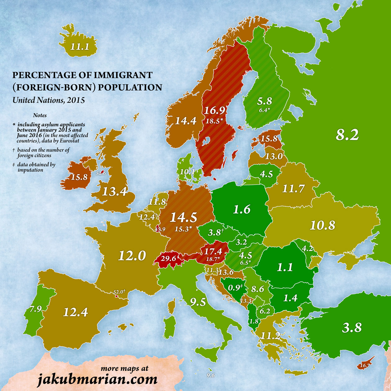
The following map shows the number of immigrants to European countries as a percentage of the total population of each given country. It is based on a 2015 study by the United Nations.
However, the UN report does not take the recent developments (between January 2015 and June 2016) in the so-called European migrant crisis into account. To make the map more up-to-date, I used the official Eurostat data on the number of asylum applicants between January 2015 and June 2016 (minus the number of rejected applicants) and added a secondary figure (marked with an asterisk) into the map, consisting of the UN data + the Eurostat data (for the most affected countries; countries without a second figure were affected by 0.4 or less, most by 0.2 or less).
Please note that higher percentages are shown in red to make them readily identifiable, but the colour is not intended to indicate whether having more immigrants is a good thing or a bad thing; that can only be decided on a case-by-case basis. Also note that Kosovo is grouped together with Serbia in the UN report.
To interpret the map (and the following maps) correctly, it is important to understand what immigrant (or foreign-born) means within the context of this study. A person is said to be foreign-born if they reside in a certain country but were not born within the current borders of that country. For example, a person living in Portugal born in Portuguese Angola before it became a sovereign nation would still count as a foreign-born individual, since he or she was not born within the borders of modern-day Portugal, even if that person had Portuguese citizenship since birth.
Now, where do the majority of immigrants come from? The following map shows exactly that. Note that asylum applicants between January 2015 and June 2016 form a comparatively small group (as can be seen from the map above), so the prevalent countries of origin remain unaffected by the crisis:
Of course, most immigrants have been living in the given countries for many years or decades, so it is natural to be interested only in the most recent developments. The following map shows the difference in percentages of immigrants between 2010 and 2015 (figures marked with “*” have the same meaning as in the first map above).
A small note on the methodology: To get the difference, I took the number of immigrants in 2010 from the same UN report and divided it by the population in 2010, the result of which is the corresponding percentage in 2010, which I then subtracted from the figures in the first map. This means that positive and negative numbers do not necessarily correspond to an increase and a decrease, respectively, in immigrant population—if the native population shrunk and the number of immigrants stayed the same, the difference is still positive, and vice versa.
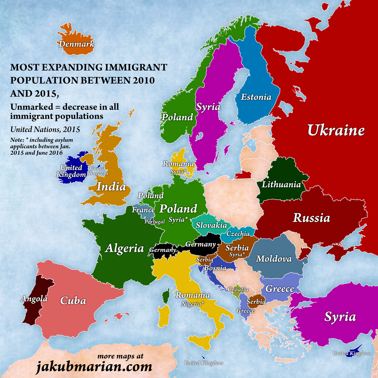
Finally, the picture would not be complete without knowing the most common countries of origin of immigrants between 2010 and 2015, so here it is (uncoloured regions mean that, according to the UN report, the number of immigrants of any country of origin actually decreased during that time period):
By the way, I have written several educational ebooks. If you get a copy, you can learn new things and support this website at the same time—why don’t you check them out?
About the author: Jakub Marian is a 27-year-old Czech linguist, mathematician, author and artist living in Berlin. You can see his biography here.


