 Sometimes you get Christmas cards that are touching, funny or quirky. Rarely do you get a card that’s literally data driven.
My wife and co-CEO Cheryl got a digital Seasons Greet greeting from Jan Willem Tulp, our friend who lives in The Hague (Den Haag) owns Tulp Interactive, a graphic arts and data visualization firm.
So, when he creates a digital Christmas card, you can expect something completely unexpected. The greeting converts your message into a custom infographic card.
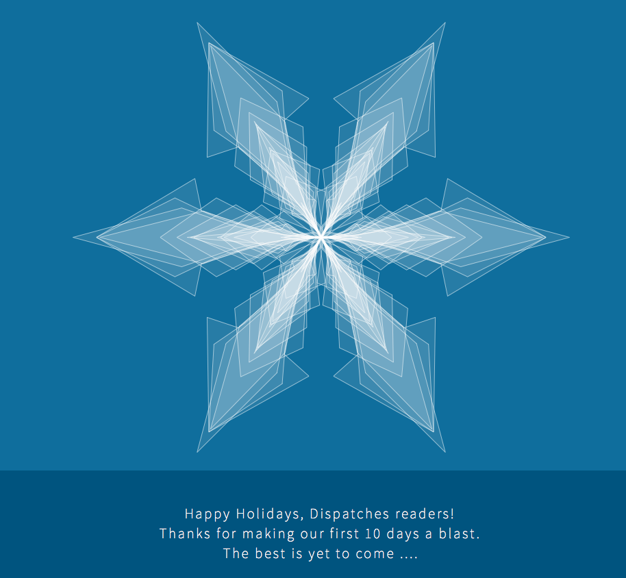
This year, he created a small visualization that allows you to generate a custom snowflake shape based on a the text of a seasonal greeting.
“Create your own data snowflake and share it with your friends and family, or just play around typing in strange words to see what shapes you can generate,” he wrote in an email.
Here’s how it works:
First, the graphic only responds to letters, not numbers, and it’s case insensitive. Each word creates a new shape (repeated 6 times to create the hexagonal snowflake shape) on top of the previous ones. Each word determines the form of the shape. Letters are assigned numbers from 1 to 27, but the letters are sorted based on frequency in the English language.
So “e”, the most used letter, gets assigned 1, and “z” – if I remember correctly – the least-used letter gets assigned 27. The length of the spoke is determined by the sum of the numbers for each letter, so different words may have the same sum. Then each letter of each word is assigned a position on the length of the spoke, again based on the order of frequency of the letters in the English language, with “e” in the center of the snowflake and “z” at the end of the spoke. If a letter is used multiple times in a word it will make the shape wider at the position of letter. I have also added my own exponential function that creates the nicely curved shape.
All we can say is, “Wow, we wish we were that smart and creative.”
To create your own Christmas card, just go to the Tulp Interactive website here and it’s the first projected listed.
Here are just a few of the stunning, award-winning projects Tulp Interactive does from Jan Willem’s website:
• A visualization of a new research that shows the estimate of 3.04 trillion trees in the world. The visualization was used as the cover image of Nature magazine, and also an animation was produced from this visualization.
• A project for Natural Recall showing the interconnection between humans and plants. This visualization is an artistic approach to show the many uses of plants for humans, based on the Plants for a Future dataset.
• A “Goldilocks” visualization for the Space-themed opening night of Visualized 2015. The visualization shows various aspects of exoplanets considered to be potentially habitable, also known as “Goldilocks” planets … not too hot, not too cold, but just right for life.
• The Flavor Connection for Scientific Magazine. It’s a recreation of a network visualization from a research paper showing which food flavors and ingredients go well together, based on the number of compounds they share.
Co-CEO of Dispatches Europe. A former military reporter, I'm a serial expat who has lived in France, Turkey, Germany and the Netherlands.


